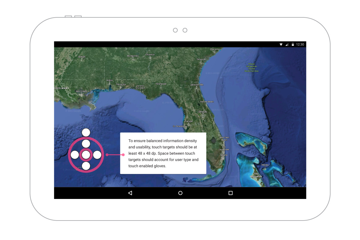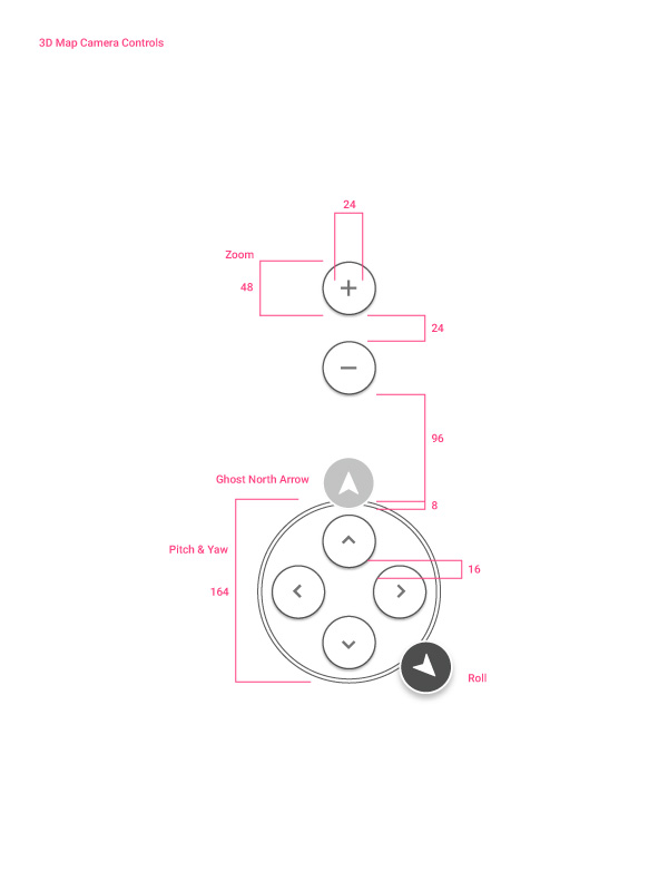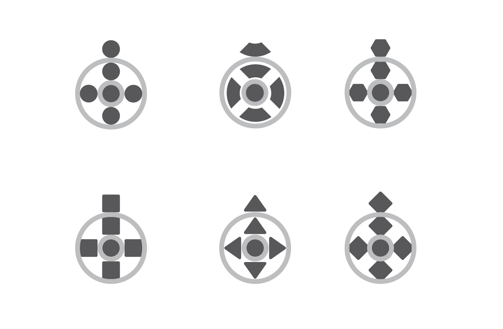

A touchscreen can be problematic for smaller interaction elements, designing those elements took a number of design cycles to find a shape, size, and space that fit the user's input method.
The added spacing helps in a few areas, it allowed the user to keep awareness of the environment beneath the elements and reduced unintended direction pressing.
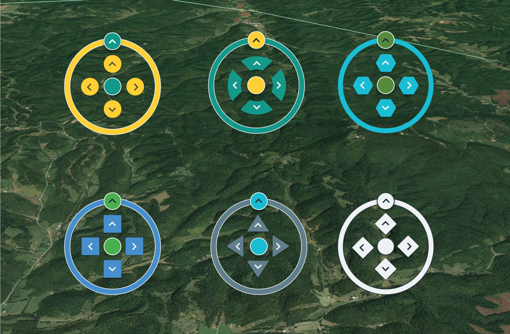
Keeping with the clean and simple mantra, a white primary color paired with a dark grey accent allowed the control set to be useable on a variety of backdrops.
To be safe, we tested a grouping of examples. The only big caveat was that the color red invoked a sense of error or harm, but its visibility on earthly environments was a consideration.


